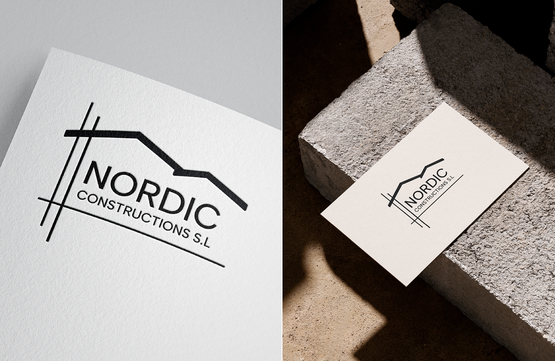
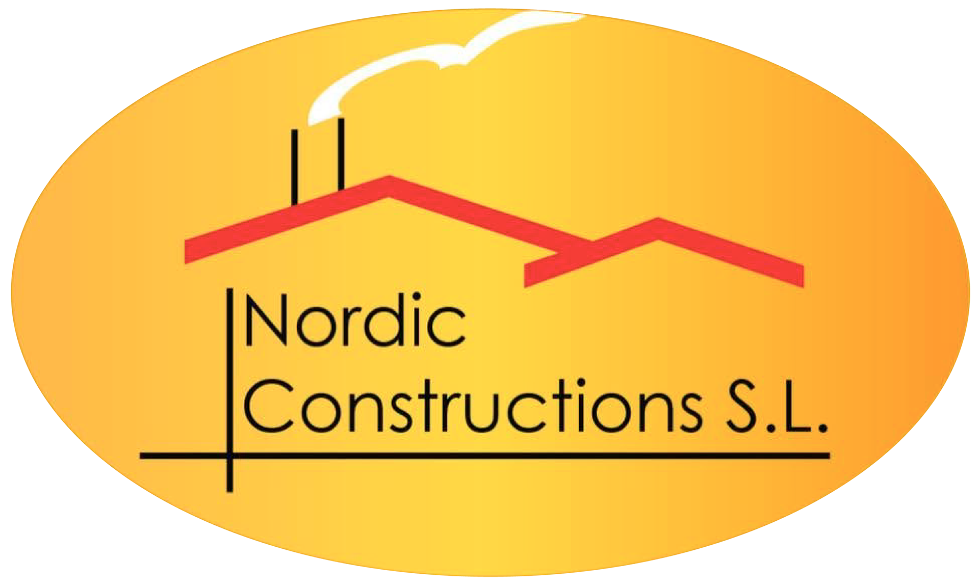
For this rebranding project, the goal was to modernize the visual identity while preserving the brand's most meaningful element. The client wanted to retain the two roof shapes, which symbolize the father-and-son partnership behind the company and represent its heritage and values.
The old logotype:
My proposals:
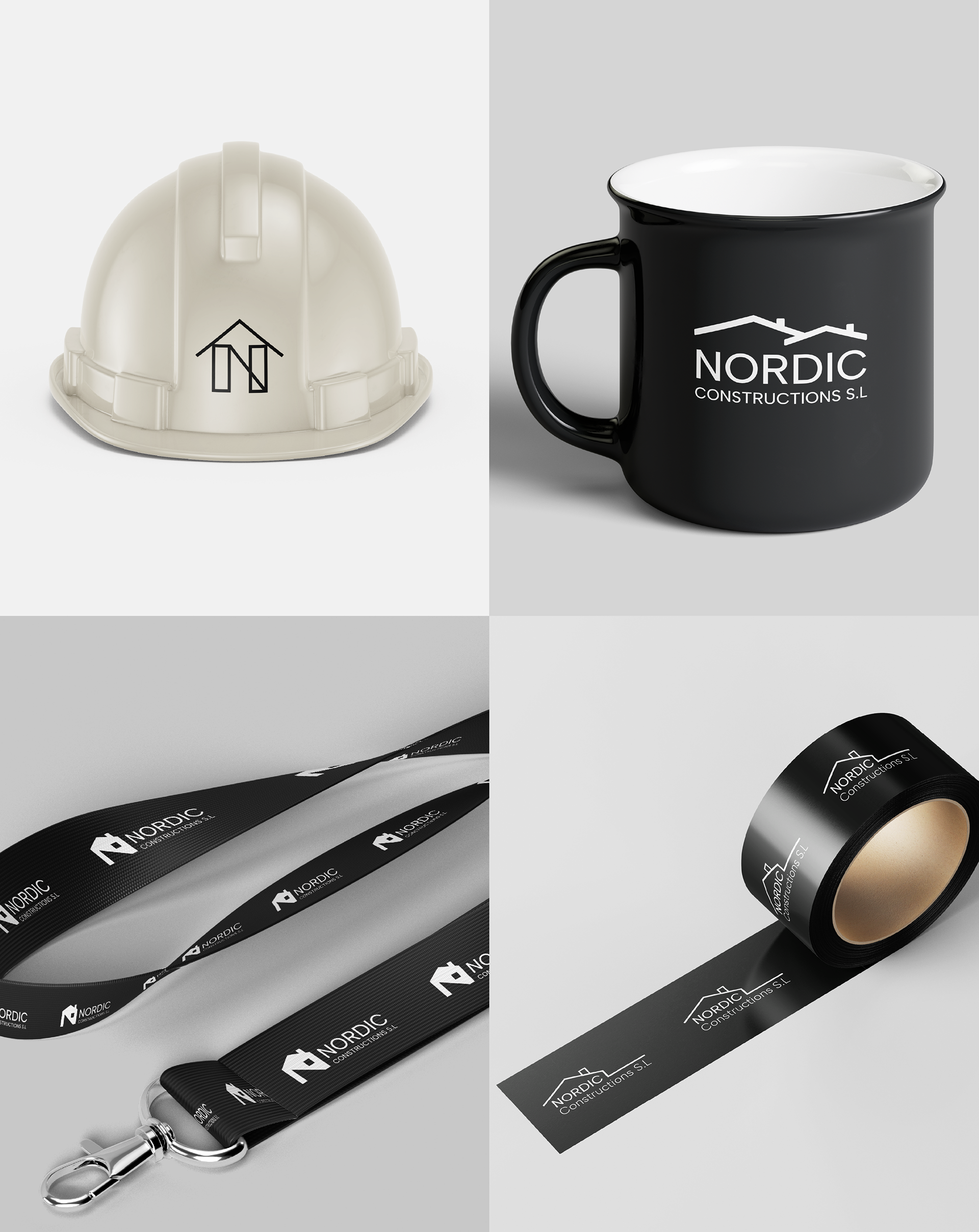
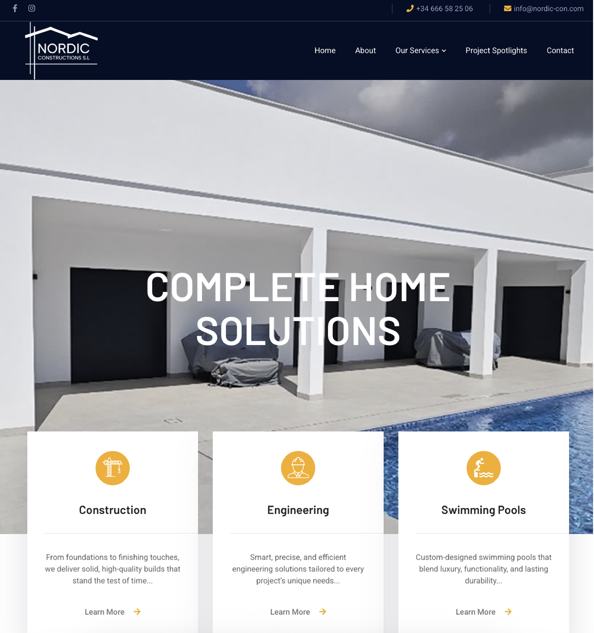
The final logotype:
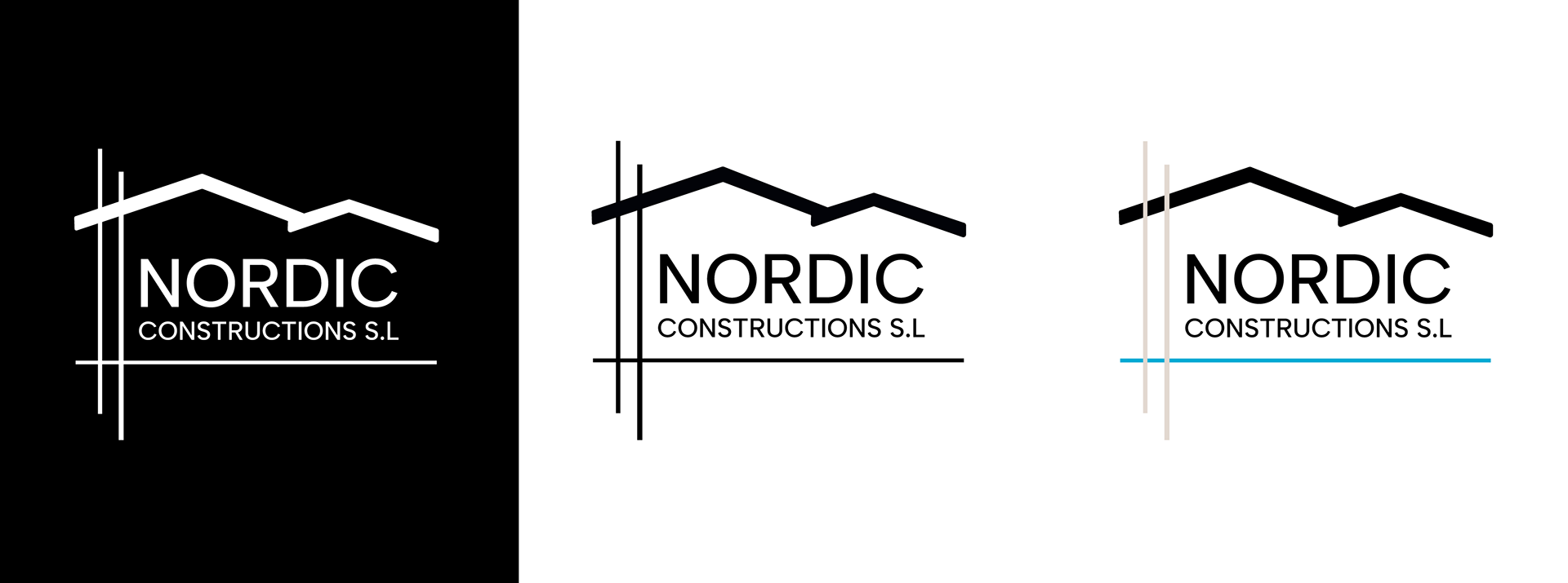
The redesign focuses on cleaner lines, improved balance, and a more contemporary look, creating a logo that feels fresh while remaining instantly recognizable.
The logo was developed in black, white, and a full-color version to ensure flexibility across both print and digital applicationsThe color palette was carefully chosen to reflect the company's services and identity. A warm sand beige evokes Mediterranean-inspired luxury construction, while a deep blue represents the company's expertise in designing and building swimming pools. Together, the colors communicate quality, craftsmanship, and elegant outdoor living.